Topic 4, Misc. Questions
You import two Microsoft Excel tables named Customer and Address into Power Query.
Customer contains the following columns:
Customer ID
Customer Name
Phone
Email Address
Address ID
Address contains the following columns:
Address ID
Address Line 1
Address Line 2
City
State/Region
Country
Postal Code
The Customer ID and Address ID columns represent unique rows.
You need to create a query that has one row per customer. Each row must contain City,
State/Region, and Country for each customer.
What should you do?
A.
Merge the Customer and Address tables.
B.
Transpose the Customer and Address tables.
C.
Group the Customer and Address tables by the Address ID column.
D.
Append the Customer and Address tables
Merge the Customer and Address tables.
Explanation:
There are two primary ways of combining queries: merging and appending.
When you have one or more columns that you’d like to add to another query, you
merge the queries.
When you have additional rows of data that you’d like to add to an existing query,
you append the query.
Reference:
https://docs.microsoft.com/en-us/power-bi/connect-data/desktop-shape-and-combine-data
You are reviewing a query that produces 10,000 rows in the Power Query Editor.
You need to identify whether a column contains only unique values.
Which two Data Preview options can you use? Each correct answer presents a complete
solution.
NOTE: Each correct selection is worth one point.
A.
Column profile
B.
Column distribution
C.
Show whitespace
D.
Column quality
E.
Monospace
Column profile
Column distribution
Explanation:
B: Column distribution: This feature provides a set of visuals underneath the names of the
columns that showcase the frequency and distribution of the values in each of the columns.
The data in these visualizations is sorted in descending order from the value with the
highest frequency.
By hovering over the distribution data in any of the columns, you get information about the
overall data in the column (with distinct count and unique values).
A: Column profile: This feature provides a more in-depth look at the data in a column
[compared to column distribution]. Apart from the column distribution chart, it contains a
column statistics chart.
Reference:
https://docs.microsoft.com/en-us/power-query/data-profiling-tools
You have a Power BI dashboard that monitors the quality of manufacturing processes. The
dashboard contains the following elements:
A line chart that shows the number of defective products manufactured by day.
A KPI visual that shows the current daily percentage of defective products
manufactured.You need to be notified when the daily percentage of defective products manufactured
exceeds 3%.
What should you create?
A.
a Q&A visual
B.
a subscription
C.
a smart narrative visual
D.
an alert
an alert
Note: This question is part of a series of questions that present the same scenario.
Each question in the series contains a unique solution that might meet the stated
goals. Some question sets might have more than one correct solution, while others
might not have a correct solution.
After you answer a question in this scenario, you will NOT be able to return to it. As
a result, these questions will not appear in the review screen.
You have a clustered bar chart that contains a measure named Salary as the value and a
field named Employee as the axis. Salary is present in the data as numerical amount
representing US dollars.
You need to create a reference line to show which employees are above the median
salary.
Solution: You create a median line by using the Salary measure.
Does this meet the goal?
A.
Yes
B.
No
Yes
The 50th percentile is also known as the median or middle value where 50 percent of
observations fall below.
Reference:
https://dash-intel.com/powerbi/statistical_functions_median.php
You have a Power BI report that uses a dataset based on an Azure Analysis Services live connection. You need to ensure that users can use Q&A from the Power BI service for the dataset. What should you do?
A.
From the Power BI service, add an enterprise gateway to the dataset.
B.
From Power BI Desktop, add synonyms and suggested questions.
C.
From Power BI Desktop, add a Q&A visual to the report.
D.
From the Power Bi service, select Turn on Q& A for this dataset.
From the Power Bi service, select Turn on Q& A for this dataset.
You are creating a visual to show the ranking of product categories by sales revenue.
Your company's security policy states that you cannot send data outside of your Microsoft
Power Bl tenant
Which approach provides the widest variety of visuals while adhering to the security policy?
A.
Use default visuals or custom visuals uploaded from a .pbiviz file.
B.
Use only default visuals.
C.
Use default or any custom visuals from the marketplace.
D.
Use default or certified custom visuals.
Use default or any custom visuals from the marketplace.
Note: This question is part of a series of questions that present the same scenario. Each
question in the series contains a unique solution that might meet the stated goals. Some
question sets might have more than one correct solution, while others might not have a
correct solution.
After you answer a question in this scenario, you will NOT be able to return to it. As a
result, these questions will not appear in the review screen.
You have a clustered bar chart that contains a measure named Salary as the value and a
field named Employee as the axis. Salary is present in the data as numerical amount
representing US dollars.
You need to create a reference line to show which employees are above the median
salary.
Solution: You create a constant line and set the value to .5.
Does this meet the goal?
A.
Yes
B.
No
No
Explanation:
Instead create a percentile line by using the Salary measure and set the percentile to 50%.
Note: The 50th percentile is also known as the median or middle value where 50 percent of
observations fall below.
Reference:
https://dash-intel.com/powerbi/statistical_functions_percentile.php
You have a collection of reports for the HR department of your company.
You need to create a visualization for the HR department that shows a historic employee
counts and predicts trends during the next six months.
Which type of visualization should you use?
A.
scatter chart
B.
ribbon chart
C.
line chart
D.
key influences
line chart
Explanation:
The best data for forecasting is time series data or uniformly increasing whole numbers.
The line chart has to have only one line.
Try forecasting: Try the new forecasting capabilities of Power View today on your own data
or with the sample report available as part of the Power BI report samples. To view your
own data, upload a workbook with a Power View time series line chart to Power BI for
Office 365.
Reference:
https://powerbi.microsoft.com/en-us/blog/introducing-new-forecasting-capabilities-in-powerview-
for-office-365
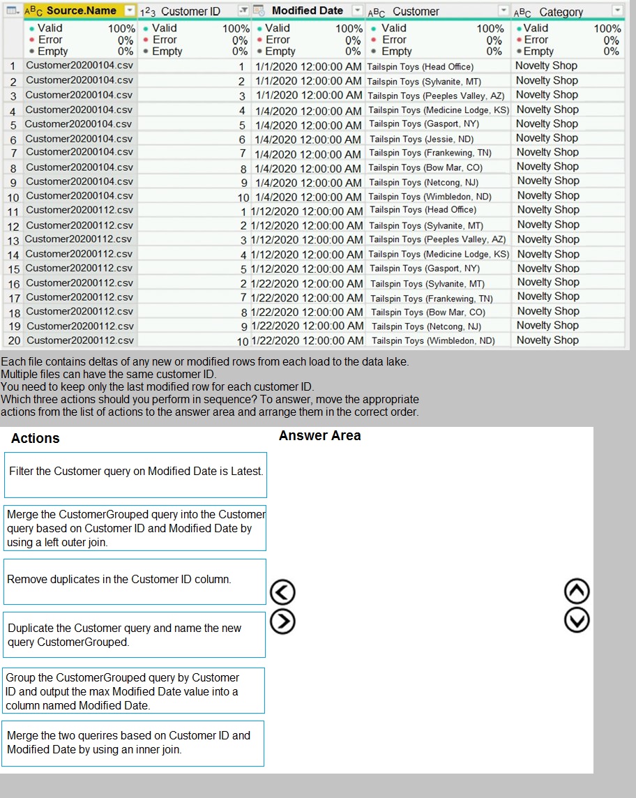
You have a query named Customer that imports CSV files from a data lake. The query contains 500 rows as shown in the exhibit. (Click the Exhibit tab.)

You plan to create a dashboard in the Power BI service that retrieves data from a Microsoft
SQL Server database. The dashboard will be shared between the users in your
organization.
You need to ensure that the users will see the current data when they view the dashboard.
How should you configure the connection to the data source?
A.
Deploy an on-premises data gateway (personal mode). Import the data by using the
Import Data Connectivity mode.
B.
Deploy an on-premises data gateway. Import the data by using the Import Data
Connectivity mode.
C.
Deploy an on-premises data gateway. Import the data by using the DirectQuery Data Connectivity mode.
D.
Deploy an on-premises data gateway (personal mode). Import the data by using the DirectQuery Data Connectivity mode
Deploy an on-premises data gateway (personal mode). Import the data by using the DirectQuery Data Connectivity mode
Explanation:
References: https://docs.microsoft.com/en-us/power-bi/desktop-directquery-about#powerbi-
connectivity-modes
| Page 6 out of 29 Pages |
| Previous |