Topic 4, Misc. Questions
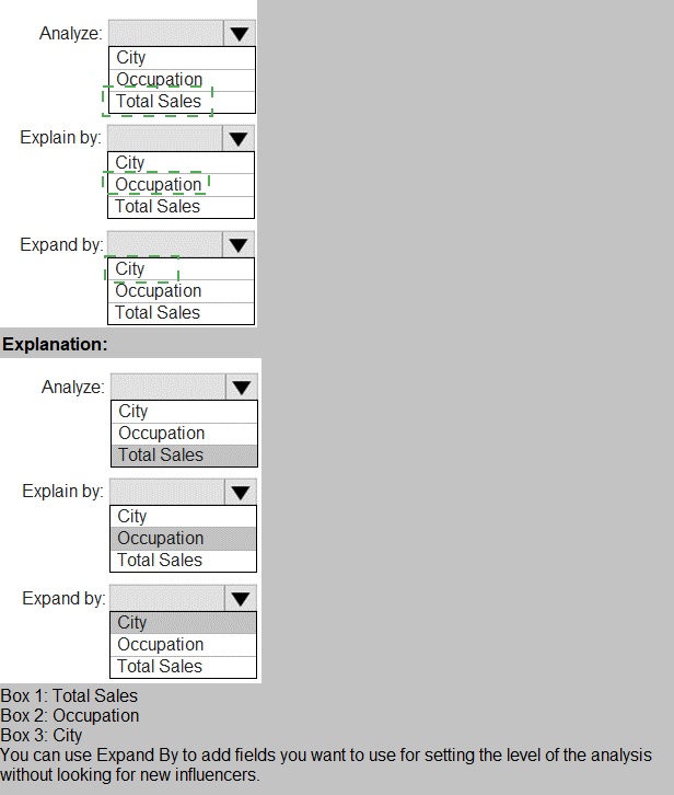
You have a table that contains the following three columns:
City
Total Sales
Occupation
You need to create a key influencers visualization as shown in the exhibit. (Click the Exhibit tab.)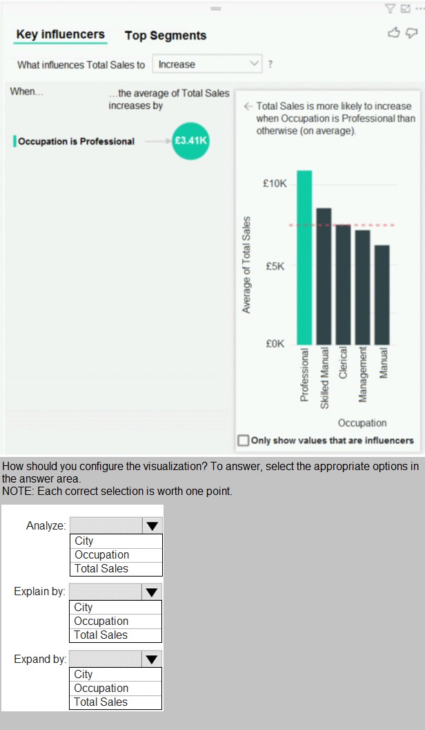
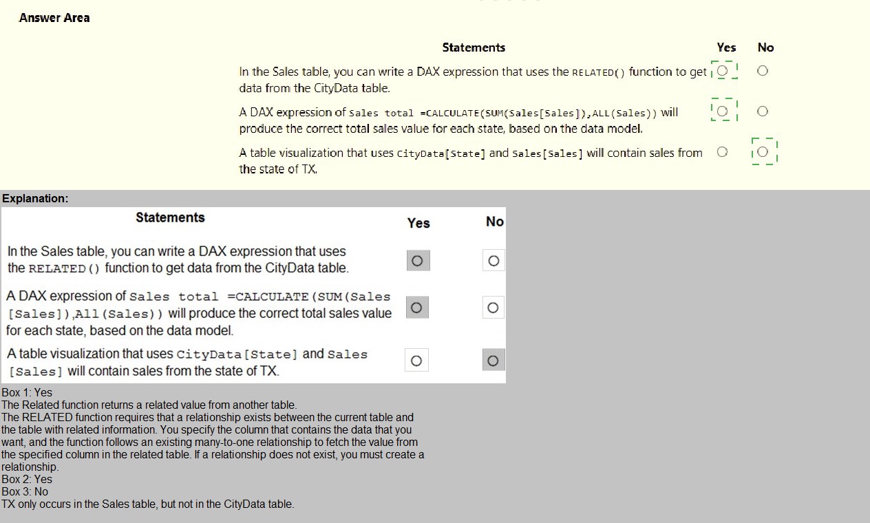
You are creating a Microsoft Power Bl model that has two tables named CityData and Sales. CityData contains only the data shown in the following table.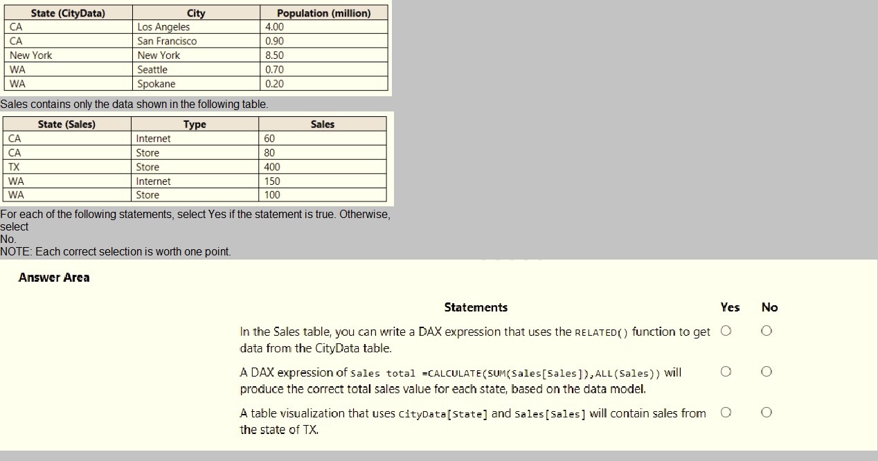
You have multiple dashboards.
You need to ensure that when users browse the available dashboards from powerbi.com.
they can see which dashboards contain Personally Identifiable Information (Pll). The
solution must minimize configuration effort and impact on the dashboard design.
What should you use?
A.
Active Directory groups
B.
tiles
C.
data classifications
D.
comments
Active Directory groups
Note: This question is part of a series of questions that present the same scenario. Each question in the series contains a unique solution that might meet the stated goals. Some question sets might have more than one correct solution, while others might not have a correct solution.
After you answer a question in this section, you will NOT be able to return to it. As a
result, these questions will not appear in the review screen.
You have a Power BI model that contains two tables named Sales and Date. Sales
contains four columns named TotalCost, DueDate, ShipDate, and OrderDate. Date
contains one column named Date.
The tables have the following relationships:
Sales[DueDate] and Date[Date]
Sales[ShipDate] and Date[Date]
Sales[OrderDate] and Date[Date]
The active relationship is on Sales[DueDate].
You need to create measures to count the number of orders by [ShipDate] and the orders
by [OrderDate]. You must meet the goal without duplicating data or loading additional data.
Solution: You create measures that use the CALCULATE, COUNT, and
USERELATIONSHIP DAX functions.
Does this meet the goal?
A.
Yes
B.
No
Yes
Explanation:
References:
https://docs.microsoft.com/en-us/dax/calculate-function-dax
https://docs.microsoft.com/en-us/dax/count-function-dax
https://docs.microsoft.com/en-us/dax/userelationship-function-dax
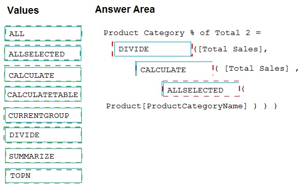
You have a Microsoft Power BI data model that contains three tables named Sales,
Product, and Date.
The Sales table has an existing measure named [Total Sales] that sums the total sales
from the Sales table.
You need to write a calculation that returns the percentage of total sales that a selected
ProductCategoryName value represents. The calculation must respect any slicers on
ProductCategoryName and must show the percentage of visible total sales. For example, if
there are four ProductCategoryName values, and a user filters one out, a table showing
ProductCategoryName and the calculation must sum up to 100 percent.
How should you complete the calculation? To answer, drag the appropriate values to the
correct targets. Each value may be used once, more than once, or not at all. You may need
to drag the split bar between panes or scroll to view content.
NOTE: Each correct selection is worth one point.
You have an Azure SQL database that contains sales transactions. The database is
updated frequently.
You need to generate reports from the data to detect fraudulent transactions. The data
must be visible within five minutes of an update.
How should you configure the data connection?
A.
Add a SQL statement.
B.
Set Data Connectivity mode to DirectQuery.
C.
Set the Command timeout in minutes setting.
D.
Set Data Connectivity mode to Import.
Set Data Connectivity mode to DirectQuery.
With Power BI Desktop, when you connect to your data source, it's always possible to
import a copy of the data into the Power BI Desktop. For some data sources, an alternative
approach is available: connect directly to the data source using DirectQuery.
DirectQuery: No data is imported or copied into Power BI Desktop. For relational sources,
the selected tables and columns appear in the Fields list. For multi-dimensional sources
like SAP Business Warehouse, the dimensions and measures of the selected cube appear
in the Fields list. As you create or interact with a visualization, Power BI Desktop queries
the underlying data source, so you’re always viewing current data.
Reference:
https://docs.microsoft.com/en-us/power-bi/connect-data/desktop-use-directquery
You create a dashboard by using the Microsoft Power Bl Service. The dashboard contains
a card visual that shows total sales from the current year. You grant users access to the
dashboard by using the viewer role on the workspace. A user wants to receive daily
notifications of the number shown on the card visual. You need to automate the
notifications. What should you do?
A.
Share the dashboard to the user.
B.
Create a subscription.
C.
Create a data alert.
D.
Tag the user in a comment.
Create a subscription.
Explanation:
You can subscribe yourself and your colleagues to the report pages, dashboards, and
paginated reports that matter most to you. Power BI e-mail subscriptions allow you to:
Decide how often you want to receive the emails: daily, weekly, hourly, monthly, or
once a day after the initial data refresh.
Choose the time you want to receive the email, if you choose daily, weekly, hourly,
or monthly.
Note: Email subscriptions don't support most custom visuals. The one exception is those
custom visuals that have been certified.
Email subscriptions don't support R-powered custom visuals at this time.
Reference:
https://docs.microsoft.com/en-us/power-bi/collaborate-share/service-report-subscribe
https://docs.microsoft.com/en-us/power-bi/create-reports/service-set-data-alerts
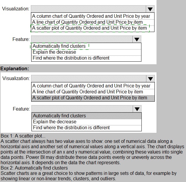
You have a dataset named Pens that contains the following columns:
Unit Price
Quantity Ordered
You need to create a visualization that shows the relationship between Unit Price and
Quantity Ordered. The solution must highlight orders that have a similar unit price and
ordered quantity.
Which type of visualization and which feature should you use? To answer, select the
appropriate options in the answer area.
NOTE: Each correct selection is worth one point.
You have a report that contains a bar chart and a column chart. The bar chart shows
customer count by
customer segment. The column chart shows sales by month.
You need to ensure that when a segment is selected in the bar chart, you see which
portion of the total sales for the month belongs to the customer segment.
How should the visual interactions be set on the column chart when the bar chart is
selected?
A.
no impact
B.
highlight
C.
filter
highlight
HIGHLIGHT as the question required us to "you see which portion of the total sales for the
month belongs to the customer segment" - in order to see WHICH portion, you need to still
see the whole visual, highlight is most appropriate. If the requirement stated to ONLY SEE
THE PORTION IT RELATES TO then filter would be appropriate.
You publish a Microsoft Power BI dataset to powerbi.com. The dataset appends data from
an on-premises Oracle database and an Azure SQL database by using one query.
You have admin access to the workspace and permission to use an existing On-premises
data gateway for which the Oracle data source is already configured.
You need to ensure that the data is updated every morning. The solution must minimize
configuration effort.
Which two actions should you perform when you configure scheduled refresh? Each
correct answer presents part of the solution.
NOTE: Each correct selection is worth one point.
A.
Configure the dataset to use the existing On-premises data gateway.
B.
Deploy an On-premises data gateway in personal mode.
C.
Set the refresh frequency to Daily.
D.
Configure the dataset to use the personal gateway
Configure the dataset to use the existing On-premises data gateway.
Set the refresh frequency to Daily.
Explanation:
https://docs.microsoft.com/en-us/power-bi/connect-data/service-gateway-personal-mode
| Page 10 out of 29 Pages |
| Previous |
Copyright © - All Rights Reserved